We recently blogged about using Tableau to visualise how 'departments and policy' content is being viewed on GOV.UK based on data for May.
In this post we share the findings of our second iteration based on data for June.
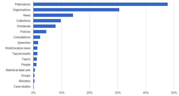
Visits to departments and policy content
There were more than 13 million visits and 28 million pageviews to all departments and policy content in June - the highest to date. Almost half of the visits (48%) involved looking at a publication page.
Refining the data for analysis
In this iteration, we refined the data (again, only for the 26 departments) to only include content relevant in the reporting period.
So for example, we only included news pages published in June and speeches and consultations published in 2014. We also extracted a list of pages (excluding news) that weren't viewed at all in June by crawling the site and matching this with Google Analytics data.
This left us with a dataset of 36,300 content pages with a combined pageviews count of 10.7 million, which we plugged into Tableau.
Content vs pageviews
The red bars on the left show the percentage of section pages that were in the refined dataset. The blue bars on the right show the percentage of pageviews for that section.
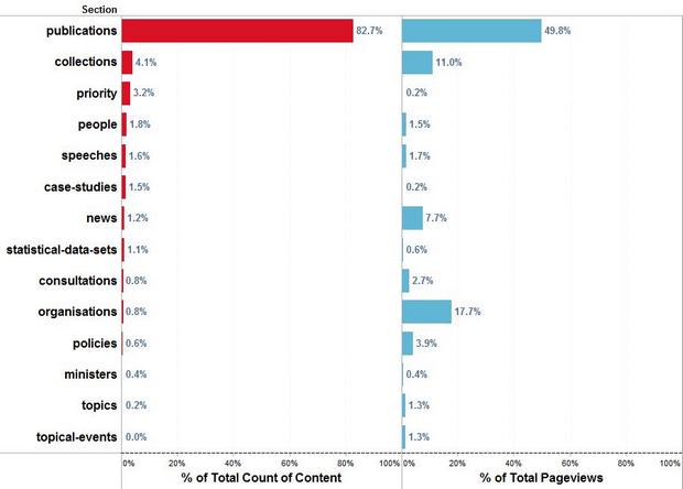
Almost 83% of the content for the 26 departments was made up of publications pages. Overall they received a much lower share of pageviews (just under 50%). By contrast, although organisations pages make up less than 1% of the content, they had a far higher share of the pageviews at nearly 18%.
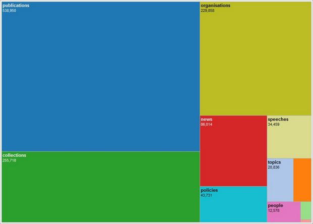
Volume of pageviews per section
This treemap shows the relative number of pageviews per section for pages published by the Home Office (as a randomly-chosen test subject). The larger the rectangle, the higher the number of pageviews.
When we break the treemap down to show individual pages within the section and their relative pageviews, it becomes more interesting.
The first treemap above shows that collections received 255,718 pageviews in June (21%). But we can see in the more detailed treemap below that a single collection page received almost 70% of those pageviews: Immigration rules.
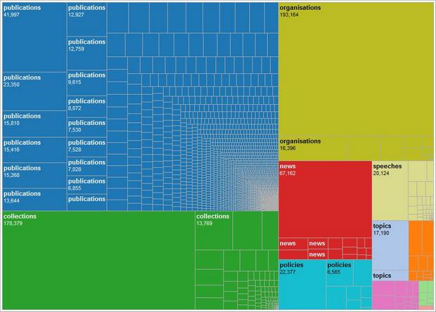
It’s a similar story with news - ‘Additional measures to meet high passport demand’ received 78% of the Home Office news pageviews.
Distribution of pageviews
To get a clearer picture of the pageviews distribution, we created histograms that grouped content by the number of pageviews received. The chart below shows this distribution across all the content in the dataset.
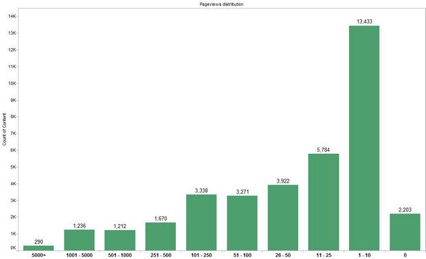
This graph shows that there are 290 content pages that received more than 5,000 pageviews in June.
But there are nearly 13,500 that got very few low pageviews (1 to 10) and more than 2,200 that weren't looked at once.
Tableau lets us break this down further and look at this by section. This histogram shows data for policy pages only:
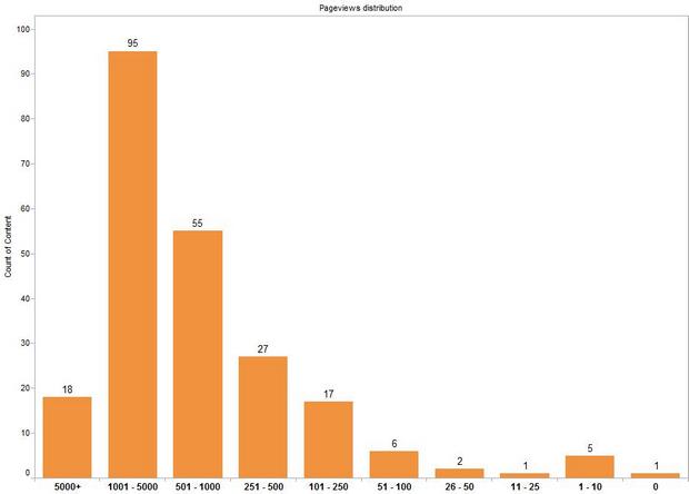
The data shows us that policies are popular; out of the 227 pages, 168 (74%) were looked at more than 1,000 times in June. (It should be noted that the data only refers to the first page of the policy format, not the detail or supporting page.)
What we'll do next
We'll continue iterating the datasets we feed into Tableau and blogging our findings. We’re looking at how to identify meaningful performance measures. We're also talking about how to share the data with departments and agencies, to improve popular pages and deal with content which isn't being looked at.
Ashraf Chohan is a Product Analyst. Rosie Cowling is a Content Designer in the departments and policy content team.

2 comments
Comment by Andrew Robertson posted on
Thanks for sharing; fascinating!
It will be interesting to see how results change as search and browse/navigation alter on the site.... some of the low views could be because people can't find the content?
Comment by Ashraf posted on
Thanks Andrew
Your point is valid, low views could be due to people not being able to find content. We'll be doing more analysis after changes to search and navigation have been implemented to assess any impact and will share the findings.