We’ve previously blogged about how we’ve been using Tableau to see how users look at departments and policy content on GOV.UK. We mentioned we wanted to make data more available to digital publishing teams, so we’re really excited to share this interactive chart which shows pageviews for different types of content. This time we looked just at the ‘publications’ format and asked 3 main questions:
- how often are departments/organisations publishing?
- what publications sub-types are they publishing?
- how is their content being viewed?
Click on the image below to take you to the chart on Tableau Public. There’s more explanation of the data and some of the insights it gives below.
Publications pages on GOV.UK
By ‘publications’ we mean everything that lives in /government/publications – including guidance, policy papers, FOI releases etc. The data only relates to the ‘splash pages’ as we’re currently not able to measure downloads of documents. There have been more than 70 million visits to publications pages since GOV.UK launched. Currently, around 44% of visits to the departments and policy section involve viewing at least one publications page.
How to view the chart
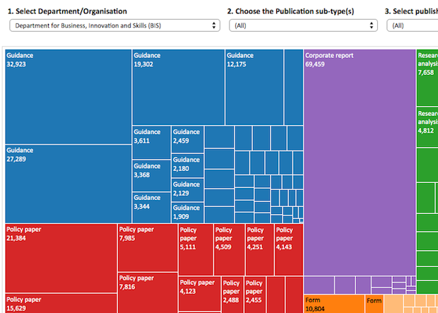
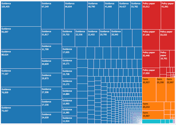
The data shows all publications pages published by the top 20 visited departments/organisations between January and July 2014. The number of pageviews is to the end of August 2014, meaning each piece of content had been published for at least one month. Publications pages have been broken down by sub-types. Each 'tile' in the treemap below represents a single page, and the size indicates the number of times it was viewed. Select the options you want to see from the drop-down menus - hovering over a tile will show the page name and the number of pageviews it received.
Insights
By selecting various departments/organisations the differences become clear, reflecting the individual business nature of each. For example, the Department for Environment, Food & Rural Affairs (Defra) publishes a large number of FOI releases…
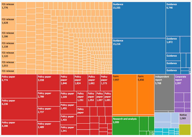
…contrasting with UK Visas and Immigration (UKVI), where the main focus is guidance.
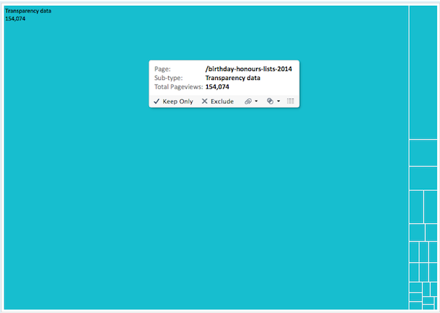
Looking at data in this way also shows us the pages which are relatively popular (and less so....). For example, selecting ‘transparency data’ published by the Cabinet Office (CO) shows that more than 90% of total pageviews were for the Birthdays honours list 2014.
Tell us what you think
We’d love to hear your thoughts on the visualisation and how we could make it more useful to you for developing your content strategy. We’ll continue to explore data using Tableau, so if you have any suggestions about data you’d like to see please get in touch.
Ashraf Chohan is a Product Analyst. Lynne Roberts is a Content Designer in the departments and policy content team.

8 comments
Comment by Jeni Pitkin posted on
This is brilliant. Thanks for sharing!
Is there a way of displaying when a piece of content was published or last updated?
Comment by Ashraf Chohan posted on
Thanks Jeni
You can segment by the month in which a piece of content was published. Click on the third drop-down menu, deselect (All) and then select the specific publishing month(s) you need.
Ashraf
Comment by Keith Prust posted on
I agree, this is great.
Will you be providing this for all publications regardless of publication date? Many of DWP's most viewed publications were published before January 2014, so the current visualisation doesn't provide an accurate picture of activity for us.
thanks
Comment by Jeni Pitkin posted on
Thanks for your quick reply.
Do you have any plans to display data in this format for documents published before January 2014?
Jeni
Comment by Simon Kaplan posted on
Hi Keith and Jeni
Thanks for your questions and how promptly you asked them after the blog was published. We had a feeling that data visualisation would be welcomed by colleagues in departments and agencies - it feels good to get that one right.
As such I can understand why you would ask for a fuller data set. We chose this date range because we felt it was a wide enough to get significant results on user behaviour.
However, we accept that some departments and agencies most viewed content may be from before the scope of this data set and that's why we made clear what the date ranges were. One of the aims of providing the data is to allow digital teams to explain to colleagues within their organisations how useful people find types of publication published on the site.
If we had more resources then we would say 'yes of course' to a request to increase the scope of the data set immediately. However, we need to balance requests like this alongside those for visualisations based on other data sets.
If the publications visualisation is the one that is most useful to you and we have resources to do more of this type of work then we'll increase the date range and produce the data more regularly.
Comment by Jeni Pitkin posted on
Hi Simon
Thanks for your reply. Your data visualisation work is definitely welcomed. The date range you selected gave us some insight on user behaviour. We can always follow up with the standard Google Analytics reports.
With reference to Andrew's second question, do you think GOV.UK digital teams need to do more to check whether publishing a publication meets a user need and the GOV.UK proposition?
Comment by Andrew Robertson posted on
Thanks for preparing and sharing this. Really interesting. Some thoughts/questions and ideas for possible improvements:
1. Search by url. Would be great if I could see how often a specific page has been viewed in comparison to other content (eg if I paste the url). Having the context of similar content would be a useful benchmark. Perhaps in future this could be linked to Whitehall so publishers can reconsider updating that page no one ever looks at?
2. Although interesting, some guidance on what we should be looking for/doing next would really help.
For example some guidance is regulatory and very specialist so does low usage matter for these?
Is high-volume use a good sign, or should we check what people are searching for from the page to ensure people didn't get to the wrong place?
Examples of how this data has been used to improve the user experience would be useful.
3. What does the filter option ‘3 publishing month’ mean? We transitioned in April so not clear how January data is shown – is it the first published date? How does content appear by month if re-published as a major change eg updated monthly?
4. Number of times viewed: is this the total number or unique visitors?
5. Not viewed: Is it possible to show how many of each publication type have not been looked at? So for example, is it correct to assume that if the least-viewed publication type ‘form’ was viewed 7 times, then all the other forms were viewed zero times? It could be quite powerful to summarise something like: 100 publications viewed a total of 10,000 times and the remaining 300 publications viewed zero times.
6. Detailed guidance: these are not currently a 'publication' but I think there are plans to move them? Will the presented data update to include them?
I realise you're experimenting and won't have all the answers or be able to deal with all these ideas. Thanks
Comment by Simon Kaplan posted on
Hi Andrew,
As always some really thought provoking and sharp questions. Here goes an attempt at responding to them...
1) We'll add your suggestion about comparing how often a page has been viewed in comparison to other content to our development backlog.
2) It's really important that we would expect some statutory niche content would have very low usage. We're thinking about tagging publications content which is statutory. This would allow users to filter by content which is non-statutory and low usage.
3) The data is shown by the publish date that appears on the content. Only content that has a publish date between January and July this year have been shown.
4) No, it's the total number of times the piece of content was viewed.
5) We agree it would be really useful to show which items had not been viewed at all and we're working on a way to get this data easily.
6) We published this data to check out digital teams' appetite for visualisations and interactivity like this. If you're hungry for more we will look at iterating this presentation and attempt to get them on the performance platform in future.