Last week we refreshed the content about the driving test on GOV.UK. It's the biggest change that's been made to it since the beta of GOV.UK launched back in February 2012.
Nothing's changed… except how the content's used
The driving test hasn't changed. It still works the same as it did last week. There aren't any new rules or processes. So why change the content?
We started looking at feedback from users, data from Google Analytics and talking to the team at the Driver and Vehicle Standards Agency (DVSA). With over 1.5 million driving tests carried out each year, there was plenty to go on.
We soon found that:
- users are searching for different things compared to 4 years ago
- the way content was originally designed no longer matches how people use it
- there were some seriously ugly URLs in use
So we set about fixing these issues.
Changed search terms means changing content
There's currently a longer wait to get a driving test than DVSA would like. They’re working hard to reduce it.
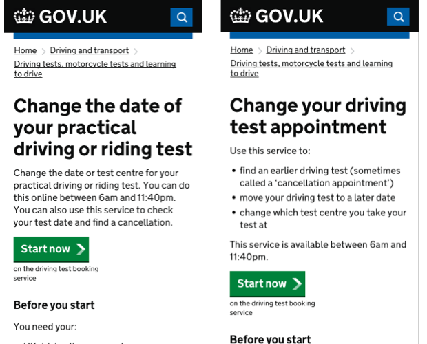
It means users have to book a driving test date a couple of months away. If they want to get an earlier appointment, they can come back to GOV.UK and see if something sooner has become available. So there are lots more searches for ‘earlier driving test’ and similar terms.
The service page previously mentioned this in passing, but we've now put this up front so it's clearer to users. It should help the page to get ranked higher in results for people searching for an earlier test.
Using search data to identify gaps in content
We've also published new content, like this page about upgrading an automatic car driving licence. We found that users were searching for how to do this, but the complete process wasn't explained in a single place on the site. Now it is.
A guide designed with mobile (even more) in mind
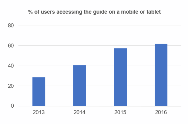
Just 3 years ago, 28.5% of people viewing the driving test guide were using a mobile device or tablet. That's now at 62.0%.
Mobile users use guides differently
Most users on a mobile device move through the guide from one part to the next. Users on a desktop tend to move around the parts a bit more freely.
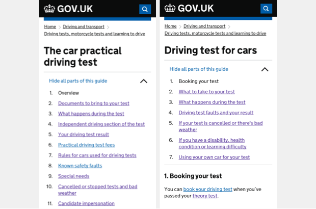
The version of the guide we've just replaced had 11 parts to click through. The new one has 7. It makes it quicker and easier for mobile users to go through the guide.
We're also relying less on related links. These appear in the right-hand column on a desktop. But on a mobile, they wrap under the main body.
We found that mobile users are less likely to use them, so we've made sure that the body text has relevant links in it.
Working on content the way users see it
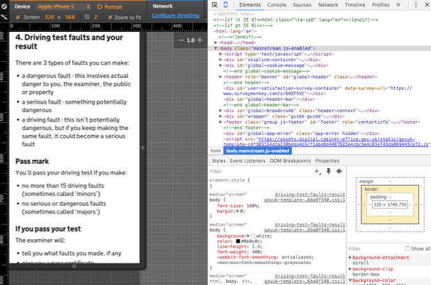
We used Chrome DevTools' Device Mode as we designed this new version of the guide. We worked as little as possible in a desktop view. We wanted to see the content exactly as most users would.
Replacing ugly URLs
The old guide about the driving test was published at www.gov.uk/practical-driving-test-for-cars. Imagine trying to give that out over the phone!
Individual guide part URLs get even longer. For example, the part about using your own car for the test was www.gov.uk/practical-driving-test-for-cars/rules-for-cars-used-for-driving-tests.
So we've made the URLs shorter and more memorable.
The guide is now at www.gov.uk/driving-test, and the part about using your own car is at www.gov.uk/driving-test/using-your-own-car.
And of course, all the old links are redirecting to the new.
Measuring all the things
The next thing we’re going to do is measure how things have improved. We want to make sure that we've made it easier to find services, and that mobile users are having a better experience.
When we've got enough data, we'll start analysing and do a follow-up blog post so you can see what happened.
The GOV.UK content team tries to spend 20% of its time doing improvement work like this. So if you work in a department or agency and want to work with us to improve something, let us know.
 The GOV.UK app went live in public beta in July 2025. Find out what’s been happening, and what’s coming next,
1 comment
Comment by Deandra Nusa posted on
I like how you're thinking about "prettier" URL's as I was struck by how difficult it was for the person on the telephone to give me the website address for the British Embassy in Trinidad and Tobago (www.gov.uk/world/trinidad-and-tobago or "w w w dot g o v dot u k forward slash world forward slash Trinidad dash and dash Tobago"!!). Why do we need "world" in the URL anyway, it's not like there's going to be a Trinidad and Tobago on Mars anytime soon.....