On GOV.UK, we’ve just completed our 7th wave of usability benchmarking. It’s something we do every 6 months to get an insight into whether our efforts to improve GOV.UK are having a positive impact on the overall user experience.
What is usability benchmarking?
We’ve been benchmarking a range of high-volume tasks on GOV.UK for the past 4 years. They cover things from checking when you can get your State Pension through to working out what the letters in your tax code mean.
We’ve kept both the tasks and the methodology broadly consistent since we started benchmarking. It’s important to do this, so that the data we report is comparable. However, there is a fine balance to strike: we need to ensure comparability, but we also need to ensure our research is representative of how people use GOV.UK. So, we made some tweaks this time around.
What did we change?
In the past, we’ve asked users to attempt the tasks on a desktop, starting from the GOV.UK homepage. We know that this isn’t an entirely accurate reflection of how people use GOV.UK. The majority arrive from external search and don’t land on our homepage. Just under half of visitors are using either a mobile or tablet.
So, for this round of benchmarking, we started one sample of users on Google, and the other on GOV.UK. In benchmarking, we use data from remote usability testing to focus our research. For example, if a task has a high fail rate, or if it is particularly time-consuming, we’ll take it into the user research lab to find out why. In this round, we kept the remote study on desktop, but tested on mobile in the lab.
This approach allowed us to maintain our historical benchmark, but also enabled us to do some comparative analysis of user journeys from different starting points using different devices.
In this post, I’m going to focus on the problems we identified. We saw plenty of positive things too, but because the point of benchmarking is to figure out where we can make things better, here I’m going to talk mainly about what we need to improve.
What did we learn?
Getting an answer without coming to GOV.UK
In one of the tasks we ask people to find out what the letters in a specific tax code mean. When searching for this information on Google, users were presented with a snippet of information taken directly from GOV.UK explaining what the relevant tax code meant. So, often they didn’t even need to visit GOV.UK to find the information that they needed.
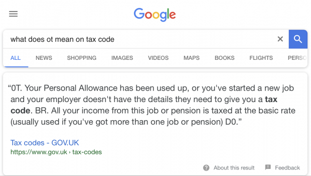
However, on other occasions, snippets displayed the wrong answers. For example, a snippet about the US retirement age appeared when users searched for information about their State Pension age. It’s pretty difficult to differentiate content when it is presented as plain text on a search engine results page, without any of the associated branding to help you figure out where it’s coming from.
Rise of the voice searchers
In this wave of benchmarking, we observed users asking direct questions to Google via voice search, and expecting a specific answer according to their own circumstances. So, taking the tax task example again, users said things like:
Hi Google, I have the tax code OT on my payslip. Please can you tell me what this means.
In the past, it’s been pretty much standard practice to build search engine optimisation around an expectation that users will search using specific keywords. However, voice search seems to be encouraging a transition toward more searches involving natural language.
As users begin to feel more comfortable using voice search and virtual assistants, it is likely that more and more people will expect to get things done without having to actually visit a website. This will increase the importance of optimising content for snippets and new types of search behaviours.
Encountering paid ads on external search
In another benchmarking task, we ask users to find the contact details for the DVLA. When searching for this information on mobile, a lot of users encountered paid private adverts for premium telephone numbers, before getting to the official contact information. Some users were able to distinguish between these, others weren’t.
Joining up content
Users need to be able to find the thing they need, even if they don’t land in exactly the right place first time around. This has been a consistent finding across recent waves of benchmarking.
In this round of benchmarking, we introduced a new task looking at how much additional support a person receiving Universal Credit can get if they start to care for a disabled parent.
A lot of the users attempting to complete this task went to guidance about Carer’s Allowance. That guidance doesn’t make any reference to or link to anything about Universal Credit. Consequently, a lot of users weren’t able to find the information needed to work out the entitlement. If related content is joined up, users can get the information they need, even if they don’t find it first time around.
Thinking about content and design together
Some of the mainstream guidance on GOV.UK uses the pagination design pattern. The information about ‘Repaying your student loan’ is an example of this. In this pattern, information is broken up into chapters that are intended to be read in a particular sequence.
However, using pagination to index and order content can be problematic because it can hide crucial context from users, especially when they don’t start at the beginning of the guidance.
For example, the student loan repayment guide’s overview page provides important context around the different repayment plans you might be on. You need to know what plan you’re on in order to understand how much you’ll repay and when you’ll need to repay it.
Most people who took part in the testing searched for things like ‘How much of my student loan do I need to repay’ and ended up straight in the ‘What you repay’ section of our guide. From here, they quickly became confused and lacked the context around the different plans set out in the overview.
Where we use the pagination pattern, we need to ensure content is joined up. We need to think carefully about the interdependency between content and design, and ensure they work together.
What we’re going to do about this
We learned a lot in this wave, much of which we might not have found out had we maintained the same approach of benchmarking on desktop starting on GOV.UK. Adapting our approach to make it more representative of the way people actually use GOV.UK allowed us to identify new issues, which we’re now working hard to fix.
In a few months, we’ll run another round of benchmarking with the same methodology to measure the impact of the changes we’ve made. Keep an eye on this blog for future updates if you'd like to read more about how this work is going.
Michael is a user researcher on GOV.UK. You can follow him on Twitter.
