Our next stage of improving navigation on GOV.UK is focused on topic-based browsing. This is a set of pages on GOV.UK designed to help users find the right service or bit of guidance for their needs. By improving this navigation, our aim is to make it easier for the millions of people who use GOV.UK every day to find the essential information and services they need.
For example, topic-browse allows users to see the range of Childcare and parenting support available to them. The user can then narrow this down based on their immediate needs, for instance, to specific guidance around Pregnancy and birth. On that page the user can find short manageable lists relating to specific tasks, such as ‘Working and time off when you're having a baby’.
While some users will use search to find information like this, we know that many users on GOV.UK prefer to browse through the site, particularly if they are unfamiliar with a topic, don’t know what to search for, or want to see everything available to them.
To make improvements to the topic pages we first ran in-depth research with small groups of users, followed by a large-scale test on GOV.UK to measure impact. Following our analysis of the test results, we rolled out the new design to all GOV.UK users last week.
Let’s dive into what we’ve changed, why we’ve changed it and what we’re going to do next.
Our previous design
Our previous design, introduced in 2014, was based on 3 columns as shown in the screenshot below.
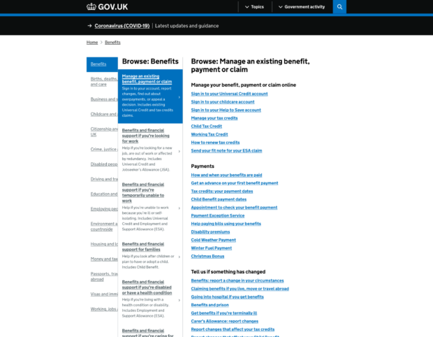
However, there were a few problems with this design that we wanted to fix:
- while 3 columns worked well on desktop, its benefits did not translate onto mobile, which is how two thirds of users now experience GOV.UK
- the overlapping layout had several hard to fix accessibility problems such as not working well with browser zoom
- this was a very information-dense experience - we’ve seen consistently in research that presenting long lists of links like this can overwhelm users
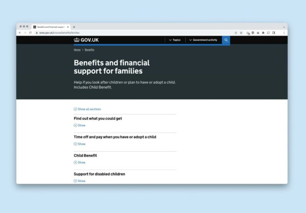
Our new design
The 2 main starting points for browsing GOV.UK by topic - the sitewide menu and the homepage - are unchanged.
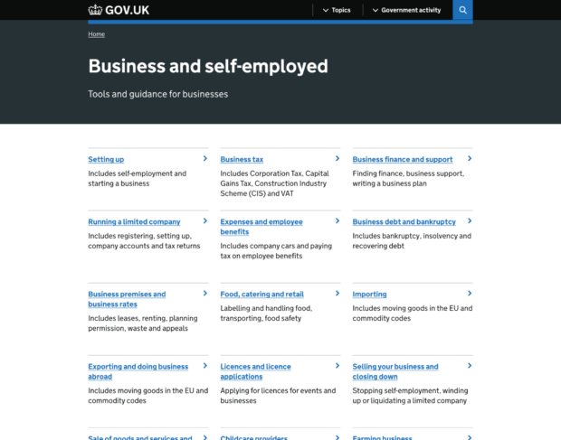
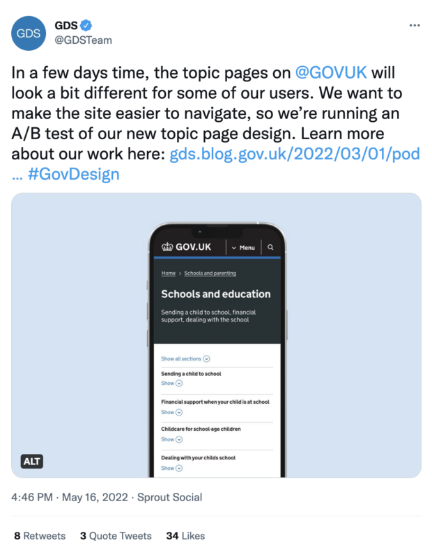
However, when a user picks a topic, they'll now see a simple grid page. This displays the subtopics of the topic they have chosen.
Having selected a subtopic, the user moves to the next page. This is a list page - it displays a curated list of links to services and information listed A-Z or grouped into categories.
We tested this new design using an A/B test. During this test period, 50% of GOV.UK users got this new design, 50% had an unchanged experience. This allowed us to assess the impact the new design had on user behaviour.
The results
We found that the new design increased our key performance indicator for these pages: clickthrough rate to content. Overall this increased from 61.6% to 65.1%. We tracked a range of other metrics which might indicate a knock-on effect of the new design and saw no indication of problems.
The new page design also improves accessibility, simplifying the experience for users of screen readers and people who magnify the page. The new design also significantly increases the size of touch targets, the area of the page you need to tap to follow a link. We’ve seen this improve the overall mobile experience, especially on smaller phone screens, and can be particularly helpful for people with a tremor or motor impairment.
There was one user behaviour we noticed that gave us some pause. Specifically on mobile, users are opening the expanding sections at a lower rate than on desktop, and at a lower rate than we expected. So we’re going to factor an investigation of this into our rollout.
Rolling out the new design
We rolled out the new design to all users last week.
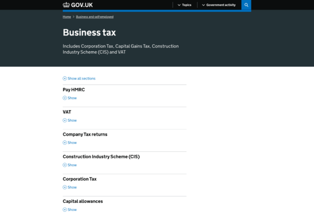
We’re also going to test a variation of the design that uses dividers instead of the expanding sections. On subtopic pages like Business tax, 50% will see the page with expanding sections, and 50% will see these pages with dividers, as shown in the screenshot below.
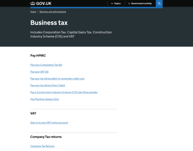
This additional test will help us better understand whether there is an issue with the use of expanding sections, and allow us to measure if this alternative design is an improvement.
Our wider navigation work
Our work on topics pages is part of our wider work on improving navigation. We’ve also:
- updated the GOV.UK homepage
- rolled out a consistent site-wide menu bar
The other elements we’re looking at are page-level navigation (breadcrumbs and related content links) and the GOV.UK footer.
If you have questions about this work, please get in touch with the team. We’d love to hear feedback from people using the new design.
Subscribe to Inside GOV.UK to keep up to date with our work
GDS is hiring - come join us!

13 comments
Comment by Rik Williams posted on
Super-interesting! Great to see a data-led and inclusive approach to improving topic browse.
A query about the simple grid index (desktop) — how are the options structured (and how does this join up with user behaviour)? So where the option in the top-left is the start of the list, but what happens next? Do users scan left-to-right (Z) or up-and-down (N)? Does this affect comprehension where the order of the options (on desktop) is important?
Comment by Sam Dub posted on
Thanks Rik!
The default is that topics are arranged alphabetically, with the new template designed to be read left to right. There are some topics such as: https://www.gov.uk/browse/business which aren’t arranged alphabetically but have been curated by the GOV.UK Content Design team putting the most popular subtopics e.g. ‘Setting up’ at the top of the list. This does create some inconsistency between topics, and there may be a case for reviewing some of the curation in context of the new template.
Comment by Mark posted on
This accordion pattern really doesn’t work well in any testing we’ve done, yet you say the accessibility trumps usability. That tells me you need to do more work around design. This pattern isn’t familiar to anyone, it’s clunky, takes up too much space and visually confusing for someone like me with dyslexia. Please consider the previous version and making that fully accessible.
Comment by Sam Dub posted on
Hi Mark, we would be really interested to read your research findings if you’re able to share them. If you can send us a message to govuk-enquiries@digital.cabinet-office.gov.uk and mention it’s about the new topic pages it’ll get through to me and the team. As mentioned at the end of the blogpost we plan to keep improving these pages and are currently experimenting with alternatives to the accordion pattern, so any data you can provide would be helpful.
Comment by Elizabeth Kemp posted on
Please can you Update your security certificate as google shows it as out of date and wont let me access most of your site.
Comment by GOV.UK Team posted on
Thank you for getting in touch. Our security certificate is in date - could you let us know what pages you're unable to access please?
Comment by Elizabeth Kemp posted on
DVLA
http://www.gov.uk all sites
I cant upload picture of page saved
but it says
Your connection is not private
attackers might be trying to steal your information from http://www.gov.uk
NET::ERR_CERT_AUTHORITY_INVALID
Comment by GOV.UK Team posted on
Thank you for your message. Could you try https://www.gov.uk/ with the "s" after http please and you should be able to access GOV.UK.
Comment by Elizabeth Kemp posted on
Get the same with "s" or with out
Comment by GOV.UK Team posted on
Thanks for your message. This suggests your internet browser needs to be updated. Please update your browser and try https://www.gov.uk/ again.
Comment by Elizabeth Kemp posted on
MY Google account is up to date.
I get the same with Firefox and Maxthon i doubt all 3 are out of date.
Comment by GOV.UK Team posted on
Please could you email a screenshot of the error to govuk-enquiries@digital.cabinet-office.gov.uk so we can look into this. Thanks
Comment by Elizabeth Kemp posted on
sent to the above email