One of the main ways people navigate around GOV.UK is by topic-based browsing. Topics are a set of pages covering a wide range of services and guidance, which users can then drill down into and find what they need. Topics include things like benefits or visas and immigration. By navigating through the topic, users can narrow down to what they specifically need, for example managing their tax credits or checking if they need a visa.
We’ve been improving topic-based browsing on GOV.UK for the past year. This included running an A/B test on design changes and rolling out a new design for subtopic pages.
We also tested another variation of the new design that uses dividers and open lists instead of the expanding sections on subtopic pages.
That test is now complete and the results have been positive for the latest variation. We’ve introduced this new design for all users as we saw much higher interaction rates. This blog post explains what we changed, how we tested it and how it looks now.
Previous design
Our previous design used expanding sections, as shown below.
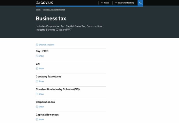
While it had better click through rates than the original design with 3 columns (65.1% to 61.6%), we still thought we could do better, particularly for mobile users. Mobile users were opening the expanding sections at a lower rate than those on desktop, and at a lower rate than we would expect so we wanted to investigate that further.
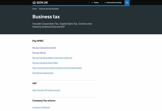
The new design
We wanted to see if there were issues with the use of expanding sections and whether exposing the full sections to users would enable them to find what they’re looking for more easily. We decided to test a new design, which uses a flat list with subheadings and dividers to organise the content. You can see that design below.
We ran another A/B test on these designs, which we called a B/C test to distinguish from the previous A/B test. Half of the people who visited saw the accordion design (B), while the other half saw the newer list design (C). The test ran from 4 August until 6 October.
The results
The data showed quite clearly that the list design performed better, for both desktop and mobile users. Overall, clickthrough rates were 75.9% for C, compared to 66% for B.
On desktop, clicks were 80% (C) to 71.3% (B), while on mobile clicks were 72.7% (C) to 61.8% (B). This means that clicks on mobile for C were even higher than for desktop on B, a significant improvement.
Of course, clickthrough rates are not the only metric that matters but we felt the differences here were significant enough to warrant a change in design. As a result we’ve removed the accordion design and all users will now see the new list design.
What we're doing next
We will continue to monitor the performance of these pages and our future work will be focusing on improving topics that are performing badly in the list design and curating the remaining A to Z topics.
We’re also going to be looking into how we can better support journeys into specialist content over the coming months. We’ll continue to keep you updated on our work on this.
You may soon spot some changes to the menu bar too. We’re doing some work to introduce a new, more compact design which may involve some further A/B testing. Keep an eye on this blog for updates about that.
If you have any questions about this work, please do ask, we love talking about our work! We also love hearing feedback, particularly if you’ve engaged with the new design yourself. You can email navigation-and-presentation-govuk@digital.cabinet-office.gov.uk.
Subscribe to Inside GOV.UK to keep up to date with our work.

5 comments
Comment by René posted on
Very useful as always. One question though: Was the content in the accordeons the same as it is now in the lists or did you change something?
Thanks in advance!
Comment by Thomas Hind posted on
Hi René, the content in the accordions was the exact same as in the lists. We had considered making some content changes to the accordion headings to see if that would improve things, but that would have been quite a big piece of work compared to changing to flat lists.
Thanks,
Thomas
Comment by C Delaney posted on
Interesting to read. I appreciate you were focusing on navigation pages, but do you think accordions are generally a less helpful format than exposed text?
Comment by Thomas Hind posted on
Hi C, I haven't seen enough evidence about accordions in other contexts to say that with any certainty, but it's a hypothesis worth testing I think.
Comment by JohnG posted on
The flat list with subheadings and dividers to organise the content is more intuitive.