The GOV.UK homepage is a really popular web page, used more than a million times each week to access essential UK government information and services. Alongside search engines like Google and our own internal site search, it’s one of the main ways into government content. It’s also used to communicate the purpose of the site and to create a sense of trust between GOV.UK and our users.
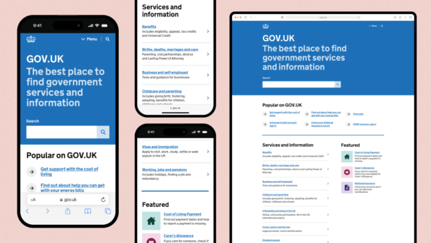
Our strategy for GOV.UK is all about growth: we’re expanding into new channels and trying to reach new audiences where they are. We want to make it easier for users to access information and services, helping them to achieve quicker and better outcomes. We last looked at the homepage a couple of years ago, but we have not changed it significantly since 2014. We want to make sure that the homepage is as useful as it can be for all users and that it continues to reflect the innovative spirit of GOV.UK. Today we’re launching the first of many significant changes to the homepage, including:
- a visual refresh
- changes to the page structure based on what we know about what users do and what they expect
- changes to content
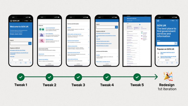
We are making improvements iteratively so that we can learn and tweak as we go. This post explains the changes we have made so far and what we plan to do next.
Bolder, mobile-first design
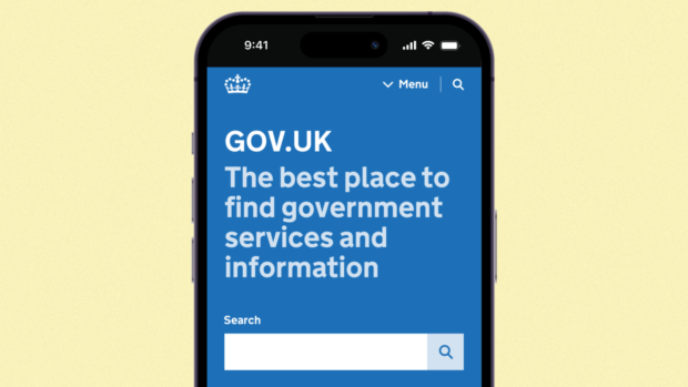
The visual design of GOV.UK is bold, simple and accessible. We’re building on a rich history of public sector design in the UK, including in our use of typography, which references road signage in the UK. But good design doesn’t stand still and needs to evolve as expectations change. For example, a decade ago, only 20% of visits to GOV.UK were made from mobile devices. Today, this number is over 60%, and continues to grow.
In response to this, as well as to other changes in user behaviour, we’ve made the design of the homepage bolder and clearer on mobile devices. We redesigned the header area and increased font sizes and spacing throughout the page. There are less boxes on it and the layout is simpler. We also reduced the amount of text on the page by removing content that did not have a clear user need or that wasn’t used much.
We think that these changes make GOV.UK easier to read and browse, and we’re thinking about how they can be brought to other areas of the site.
Easier to read
GOV.UK is made up of mostly words and links, and arranging these into clear, usable layouts takes a lot of work. This is especially true on the homepage, where almost everything is a link, as many users begin their journey here.
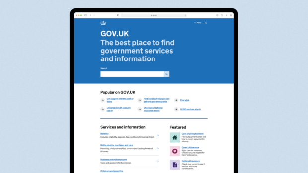
We know that pages full of links can be hard for users to scan, so we made some improvements to make the homepage easier to navigate. This includes turning the popular links into a bulleted list and increasing spacing between sections. These changes make the page easier to scan and to identify when one section ends and the next begins.
Reflective of what our users are doing
Knowing what users are doing on GOV.UK helps us improve it. For example, if the most popular link on the page is at the bottom of it, that’s probably a good indicator that it should be moved further up.
We get insights like this from analytics on page use, with a user’s consent, and from talking to our users. Over the last couple of months, we’ve been tweaking the homepage in response to these learnings. Doing it iteratively helps us carefully monitor the impact of our changes, so that we can reverse them if their impact isn’t what we expected. The changes include:
- moving search higher up because it’s the most used element of the homepage
- moving the ‘featured’ section above the ‘government activity’ section because we know more people need it
- renaming ‘topics’ to ‘services and information’ because we know it’s clearer to our users
- adding another link to the ‘popular’ section because we know people find this section useful
- turning grids into lists because we know lists are easier to scan
What’s next
We’re monitoring the impact that our changes have on what people do on the homepage. For example, we have already seen an increase in the number of people using search on mobile since we moved it higher up.
There are more changes to come, too. For example, we know that we can improve how we adapt content in response to trending user needs. We’ll be testing new design patterns to help users find relevant information more easily.
Want to join the team? We’re hiring

29 comments
Comment by Annie posted on
This is great to see! I wondered if you'd also consider adding 'before' pictures to this blogpost so people can compare.
Comment by Thomas Hind posted on
Looks good! I really like how it looks on mobile and I'm curious to see how the increase prominence of search plays out, especially on the desktop version. All the changes seem to make sense though and make the page easier to manage.
Great work Monica, Kuba and everyone else who worked on it!
Comment by Ross Ferguson posted on
Lots of helpful sounding updates here and great insights into the choices made. Thank you. And please give us an update on how they perform in the months ahead.
Comment by Sam posted on
I wonder if the boldness could extend to removing the cookies which necessitate that large consent banner? It's a jarring and annoying experience for all users.
I also do not understand why after rejecting cookies there is then another banned which needs dismissing with a 'Hide' button?
Comment by Kuba and Monica posted on
Hi,
Thank you for your comment. Our cookie banner is documented in the GOV.UK Design System and you can see some of the reasoning behind the functionality here: https://design-system.service.gov.uk/components/cookie-banner/
We’re constantly exploring how we can improve how it works, and our obligations when it comes to cookies are described in the Privacy and Electronic Communications Regulations (PECR): https://ico.org.uk/for-organisations/direct-marketing-and-privacy-and-electronic-communications/guide-to-pecr/what-are-pecr/
Thanks, Kuba and Monica
Comment by Simon posted on
How is having all sections e.g. "Popular on GOV.uk" section below the fold a _better_ user experience, especially on desktop?
It might be a cleaner design but you've got so much negative space not getting used.
Moreover, "The best place to find government services and information" doesn't actually help me to get to nagivate the site at all and takes up far too much real estate on both desktop and mobile when you could be helping people to fulfil their user needs more efficiently.
Disappointed to see the GOV.uk leaning towards form over function
Comment by Kuba and Monica posted on
Hi Simon,
Thank you for your comment. We increased text size and spacing on the page so that it’s easier to scan and read, particularly for users with access needs. This also helps us align with an upcoming change to the GOV.UK Design System, which also increases text sizes throughout: https://designnotes.blog.gov.uk/2022/12/12/making-the-gov-uk-frontend-typography-scale-more-accessible/
We tested the design on a range of devices and browser sizes to make sure that users are able to find what they need easily. We haven’t seen any issues with users not realising they can scroll down the page and our data shows that the majority of users scroll pretty far down the page on their visits to the homepage. That said, we’ll keep monitoring behaviour and tweak accordingly.
Thanks, Kuba and Monica
Comment by Sue posted on
Hi there,
Agree with Simon. Plus making the user scroll down to find popular links, is just giving the user additional work (that is if the popular links are what they were needing!).
Please adjust your colour usage. The pale blue (#CDE3F1) used for the "The best place to find government services and information" text against the header blue background (#0072B8) has color contrast issues. Although it passes WCAG level AA for large text, it fails at WCAG level AAA.
Please do increase the color contrast - remember that lots of local government websites tend to follow what the GDS does. You have a great responsibility here. Please don't let your standards slip.
Kind regards, Sue.
Comment by Kuba and Monica posted on
Hi Sue
Thanks for your comment. Accessibility is at the core of our work at GOV.UK. We always make sure that GOV.UK meets level AA and strive for AAA when possible.
In this instance, we are using the pale blue colour to subtly introduce hierarchy between the main headline and the secondary headline. We made this decision as the hierarchy is important to convey to users, and we are using the text at a large size.
Thanks, Kuba and Monica
Comment by Steph Wilson posted on
This looks really great and a lot less busy and streamlined.
The only thing I would question is the size of the header text, is there a reason you've increased the summary text?
Big banners use a lot of space so I'm wondering does it potentially get in the way when it doesn't really add much to the user?
We have noticed on our council website that people use the search box the most on our homepage so we've made it very prominent at the top of the page with little text around it.
Comment by Kuba and Monica posted on
Hi Steph
Thank you for your comment. We increased text size and spacing on the page so that it’s easier to scan and read, particularly for users with access needs. This also helps us align with an upcoming change to the GOV.UK Design System, which also increases text sizes throughout: https://designnotes.blog.gov.uk/2022/12/12/making-the-gov-uk-frontend-typography-scale-more-accessible/
We tested the design on a range of devices and browser sizes to make sure that users are able to find what they need easily. We haven’t seen any issues with users not realising they can scroll down the page and our data shows that the majority of users scroll pretty far down the page on their visits to the homepage. That said, we’ll keep monitoring behaviour and tweak accordingly!
Best, Kuba and Monica
Comment by Vicky posted on
Were your tweaks just launched to everyone on GOV.UK or did you have some form of A/B testing? It looks as if you just put changes live to everyone but just wanted to check.
Comment by Laura Stevens posted on
Hi Vicky,
Yes, thank you for checking - went live to everyone yesterday following the iterations over the past few months. We’ll continue monitoring but are relatively confident about the impact because of the recent iterations. Thank you, Laura
Comment by Dave Green posted on
...but on my laptop all I now see on the homepage is a dropdown menu, two titles and a search box. For everything else I have to scroll down.
Mobile-first, desktop very much second.
Comment by Kuba and Monica posted on
Hi Dave,
Thank you for your comment. We increased text size and spacing on the page so that it’s easier to scan and read, particularly for users with access needs. This also helps us align with an upcoming change to the GOV.UK Design System, which also increases text sizes throughout: https://designnotes.blog.gov.uk/2022/12/12/making-the-gov-uk-frontend-typography-scale-more-accessible/
We tested the design on a range of devices and browser sizes to make sure that users are able to find what they need easily. We haven’t seen any issues with users not realising they can scroll down the page and our data shows that the majority of users scroll pretty far down the page on their visits to the homepage. That said, we’ll keep monitoring behaviour and tweak accordingly.
Best, Kuba and Monica
Comment by David McKee posted on
I notice none of these designs include the huge cookie banner that pushes the search box below the fold.
Comment by Kuba and Monica posted on
Hi David, thanks for your comment. We have seen that the search usage increased which makes us confident that the cookie banner is not creating issues for users who need to search. As always, we will continue monitoring to make sure that users don’t have any issues using the page.
Best, Kuba and Monica
Comment by Lucian Costin posted on
Very good
Comment by Steve Messer posted on
I’m so glad that this design prioritised the experience on mobile devices but also made sure it worked on desktop too. (And it looks super crisp on my personal device, I love it!)
One thing I noticed from the screenshots is that the cookie banner doesn’t feature, whereas there may be many people for whom that shows. Did any usability tests (on mobile and desktop) include the cookie banner? If so, might you be able to share any findings with us on the GOV.UK Design System? https://design-system.service.gov.uk/community/share-research-findings/
It possibly depends on whether most users of the homepage are returning users rather than new users, but that would be an interesting insight to know about. Thanks in advance for anything you’re able to share!
Comment by Kuba and Monica posted on
Thanks Steve, we did tests internally to make sure the new design would work with the cookie banner - as well as other components like the emergency banner. Happy to discuss further, please put a time in our diaries - and of course anyone across GDS is welcome to our show and tells. Kuba and Monica
Comment by Oke Osharode posted on
The home page says it all with no ambiguity. This is really helpful. Welldone.
Comment by Jon posted on
"Renaming ‘topics’ to ‘services and information’ because we know it’s clearer to our users."
Will this change be reflected in the facets associated with the 'government activity' collections which still all use topics?
e.g.
https://www.gov.uk/search/news-and-communications
https://www.gov.uk/search/research-and-statistics
https://www.gov.uk/search/policy-papers-and-consultations
Comment by Kuba and Monica posted on
Hi Jon,
Thank you for your comment. The reason this has been changed on the homepage, but not on these other pages is because the word 'topics' was being used in different places on GOV.UK to refer to different things. On the homepage, the ‘topics’ heading was used to group together links to various government services and information, so we changed the heading to make it clearer to users what the section contained. On pages like https://www.gov.uk/search/policy-papers-and-consultations ‘topics’ is referring to different topics that allow users to filter the information.
As a result of the change we can now avoid using the same label to refer to two different things. Best, Kuba and Monica
Comment by Suzanne Amos posted on
Hi, Kuba and Monica,
Interesting blog post - thank you.
Is GOV.UK ever able to share user research with government agencies?
I'm a user researcher at NHS England, on the corporate website(s), and it would be really helpful to read any user research on the label change from 'Topics' to 'Services and information'.
With this year's merger between NHS Digital, Health Education England and NHS England, labels like 'topics' or 'Services and information' are of great interest to us. Admittedly GOV.UK is different to NHS England but there might be some general takeaways.
Equally happy to jump on a call if that's an easier way to share research findings/data.
Comment by Laura Stevens posted on
Thank you very much Suzanne. Yes, our content designers would be happy to chat more - please can you send an email over to govuk-enquiries@digital.cabinet-office.gov.uk and I'll make sure it gets triaged to the right place.
Best, Laura
Comment by Antonia posted on
How did the decision to use icons come about given that GOV.UK's previous stance on this was that icons were to be avoided. How will the re-use of generic icons be mitigated? Very curious to know what's led this change?
Comment by Kuba and Monica posted on
Hi Antonia, thanks so much for your comment. We still believe that icons should be avoided unless they help users achieve their goals. We didn't introduce new iconography on the homepage, but we simplified the existing icons on the Featured section so they worked well inside a square, and we used our 'action link' component on the Popular on GOV.UK to make it easier to scan the list - as we know that bulleted lists are easiest to read. Thanks Monica and Kuba
Comment by Jen posted on
This new clear design looks great, well done.
Can you explain the decision to use icons under the Featured section. The Design System says to avoid them in most cases. Did you find they helped the users to identify the links or is there another user need for them? The icons for the currently Featured items are not unique, the home icon is usually a link to the Home page and the document icon will take you to a file or a link to a file not a service. Could this be confusing for some users?
Comment by Kuba and Monica posted on
Hi Jen,
Thank you! We have not introduced new icons to the homepage, and still believe that icons should be avoided unless they help users achieve their goals. We simplified the existing icons on the Featured section so they worked well inside a square, and we used our 'action link' component on the Popular on GOV.UK to make it easier to scan the list - as we know that bulleted lists are easiest to read. We will keep monitoring how users respond to the changes and iterate accordingly. I hope this answers your question, let us know if you'd like to know more. Thanks Monica and Kuba