GOV.UK will be 3 years old this October. So we decided it was time for a group of content designers to take a more detailed look at how GOV.UK works on mobile devices. We knew GOV.UK was designed to be mobile friendly but we wanted to understand how mobile use had changed since we launched.
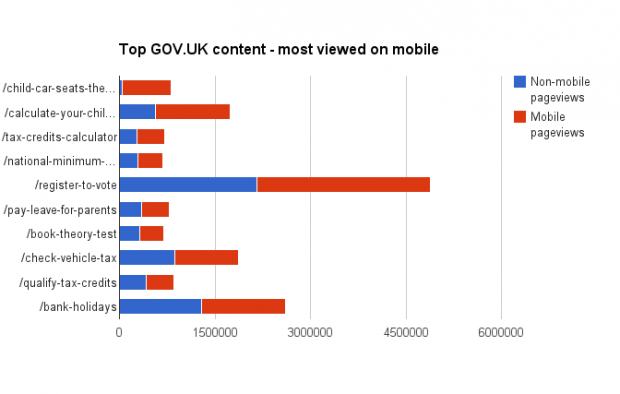
Mobile use on GOV.UK has steadily increased and the chart below shows the proportion of views by device to the top 10 pages on GOV.UK in April 2015. We defined mobile as any device that has a touch screen and isn’t a desktop.

What we did
We explored the issue from as many angles as possible by:
- looking at the data
- sharing a good book on the subject by Karen McGrane
- talking to designers, user researchers, GOV.UK product leads, developers and data analysts
- making our own observations on how different formats and content types performed on our devices
- finding out what the 'futurists' are saying
Things we learned
A week later we pooled our findings.
GOV.UK still displays well on mobile. Our user researchers told us that people think GOV.UK on mobile is good for:
- looking up quick answers or asking initial questions
- quick interactions and updates to information
But it’s not so good for longer interactions that include entering lots of data, or copying data from documents.
This is an area where we’ll focus future efforts.
Switching device mid-transaction
We also wanted to find out if users are confident switching device mid transaction. For example, if they begin a passport application on a desktop would they feel comfortable saving their application and continuing on a mobile?
User researchers have observed that if users are doing something big, long or important they’ll begin on a desktop (or for many users a tablet is good a compromise). But for an increasing number of younger and less affluent users their only access to the web is on their smartphone.
We learned that we need to have a closer look at the data to unpick what happens if, and when, users switch device.
Content designers have data needs
This project taught us that we need to look at our data in much more detail. By working with performance analysts to re-configure Google Analytics, we’ll get a more detailed picture of how users navigate through GOV.UK guides and if they use browsers and tabs differently when on a mobile.
Better data will help us to understand the differences between how mobile and desktop users interact with calculators on GOV.UK, eg the child maintenance calculator.
Understanding the context of user journeys helps us make better content design decisions. For example on a mobile, users find it simpler to navigate through a service with one question per page rather than several.
Once we understand this better we can improve the experience.
We’re also working to convert some of the most visited PDFs into HTML to make them more accessible and searchable. This will help users on mobiles.
Sharing best practice
The project has helped remind us of best practice. We’re making sure content designers:
- routinely check how content looks on different devices, eg making sure that start buttons are visible on a mobile screen without the user having to scroll
- do user research on specific device types
- compare analytics for desktop, mobile and tablet
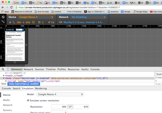
- check how a page displays on multiple devices - you can do this yourself in Google Chrome by right-clicking on a web page, then choosing ‘inspect element, then the mobile icon the from the drop-down menu

Looking to the future
As well as learning about how we can improve our approach to content design for mobile users on a day-to-day basis, we looked at what the strategists think. Karen McGrane stresses the need for ‘adaptive content’ - content that’s structured into smaller chunks and stripped of style and formatting.
If you’re interested in this topic you may find these posts useful:
- Sara Wachter-Boettcher on how National Public Radio have mastered the art of structured content
- Richard Pope on how the desktop and mobile versions of a service may be fundamentally different propositions
Subscribe to email alerts from this blog to stay informed.
Nettie Williams is a content designer on GOV.UK.
 The GOV.UK app went live in public beta in July 2025. Find out what’s been happening, and what’s coming next,
2 comments
Comment by Joanne Schofield posted on
I'd be interested to know what research was undertaken to confirm that people on a mobile find it easier to complete one question per page? Was there any additional insights into how they reacted to clicking through numerous pages, waiting for each page to load, if their reading flow was interrupted by repeated clicking etc.
With scrolling becoming second nature to most people, is there an argument that, in some circumstances, clicking through pages is becoming a bit of an outdated design pattern?
Comment by Nettie Williams posted on
Thanks for your comments Joanne. You raised some interesting points which we've been researching with users.
Colleagues have tested the one page per question format amongst others in several services. In general we find in user research that when we concentrate on one thing per page it makes it much easier to communicate that thing to the user. Our aim is to get users through the services (or transactions) we create - if there are fewer concepts for the user to understand on the screen, it will make it easier for people of various reading/comprehension abilities.
You mentioned reading flow - if there was a longer piece of content we wanted users to read and that content related to the one thing or the one question, then it would all be contained on 1 page. It's not about short pages, but about one thing per page.
Something else we've noticed is that breaking up content in to smaller chunks around separate themes, increases recognition and cognition of the points we're trying to get across.
Also validation of form errors is much easier with the one page per question format - it saves the user having to scroll to find out.
We haven't observed any users reacting to multiple pages or slow page loads, but it's worth noting that our services have very fast page load times - this is a priority for us especially for services using the one page per question format.
There's more detail on the 'one page per question' format and our user research in these 2 posts:
https://designnotes.blog.gov.uk/2014/07/14/things-we-learnt-designing-register-to-vote/
https://designnotes.blog.gov.uk/2015/07/03/one-thing-per-page/