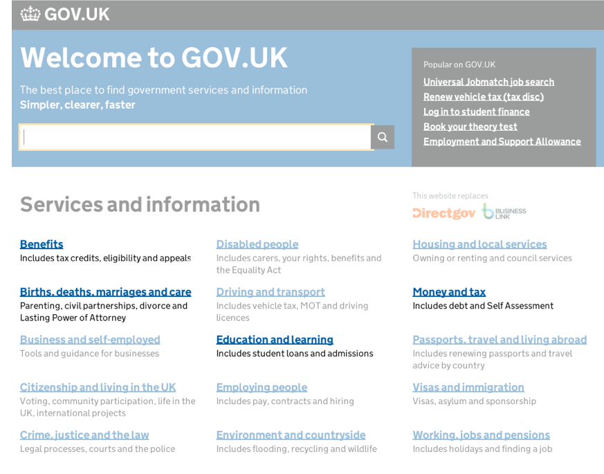
This week we’re launching a new section of GOV.UK: ‘childcare and parenting’. It contains existing content, organised in a different way: based on user need.
Right now, it looks very similar to the rest of mainstream browse, but this is just the first step towards a truly needs-based browse.
The start of an idea
Needs-based browse was conceived after the GOV.UK research team did some contextual interviews with parents of young children.
We visited 16 families in their homes, and listened to their experiences of becoming a parent. We heard about their interactions with government as they made big decisions such as how much leave to take, and whether to go back to work after giving birth.
A recurrent theme soon emerged: parents were really struggling to find an affordable way to return to work, given the high cost of childcare. Some were having to work part time at night, or relying heavily on friends to babysit, and yet many hadn’t considered looking for government help.
“I don’t know where to look, and I doubt I’d be entitled to have somebody pay for my childcare.”
Unknown unknowns
In fact, these parents had been selected for the research because they were all eligible for help with their childcare costs. But if you don’t know help exists, you can’t go looking for it. As one parent put it:
“I didn’t know what to google as I didn’t know what was available.”
Add on the fact that new parents are likely to be short on time and sleep, and it soon becomes apparent that it needs to be really, really easy for them to discover this information.
Back to the drawing board
In light of these findings, we used the GOV.UK firebreak to go back and look at how content relating to parenting and childcare is arranged on GOV.UK at the moment.
Information on finding childcare and related financial support is spread across 4 different categories:
This might make sense from a government perspective, but as soon as you look through the eyes of the user it becomes clear that it doesn’t make sense to them.
We decided to usability test the groupings with parents: could they find information on the site in the current structure? In short, the answer was no. Parents were visiting 3, 4, sometimes even 5 categories before finding the right one.
Developing a new structure
We knew we could do better, so we began gathering all the GOV.UK content we thought would be relevant to parents, and rearranging it into new groups.
To help us with this, we conducted a remote online card sort of 60 pieces of content with 100 parents. They sorted the information into groups based on what made sense to them, giving us a rough idea of how they saw this information fitting together.
We found that content around topics such as having a baby and sending a child to school was consistently grouped together. However, there was no strong grouping of content on financial help; instead bits and pieces were grouped together only sporadically.
This was consistent with the lack of knowledge we’d found in our initial research. It supported our idea that financial support content should sit alongside other, better recognised content, to help parents discover what they might be entitled to.
We created a new ‘childcare and parenting’ browse category based on the card sort. We’re calling this our ‘needs-based browse alpha’.
See the Trello card associated with this work.
Next steps
The next step is to put the new category live on GOV.UK and monitor its performance through analytics. It’ll sit alongside all the existing mainstream browse categories.
There’s still a lot more to change to help users discover information they need. Once we’ve seen how this performs, we’ll carry on iterating the pages.
The ultimate aim is to help parents discover what’s available to them, and then guide them through the process of understanding what they need to do next, or where they need to go if they have questions. Eventually, needs-based browse will include any information that's relevant to meeting a particular user need - not just mainstream content.
We think this needs-based browse model will be applicable to many other parts of GOV.UK. We intend to work on one area at a time as we uncover the needs of a particular user group and work out how they interact with government in the context of their real life experiences.
Each time, we’ll start with really understanding what people need from government, and then work out how we can best meet those needs.

 The GOV.UK app went live in public beta in July 2025. Find out what’s been happening, and what’s coming next,
5 comments
Comment by Graham posted on
Hi Charlotte,
Thanks for the post. Could you explain a bit about how you determine what exists as a browse category (either mainstream or needs-based)? Is there any science behind it or is more a 'feeling' sort of decision where there's enough related content?
Cheers,
Graham.
Comment by Charlotte Clancy posted on
Hi Graham,
For this project, we used card sorting to get an initial idea about what should exist as a browse category, and then built a first pass browse that included all the content on GOV.UK. We then tree-tested the categories to check that they seemed to make sense to parents and to work out where content should be duplicated across more than one category.
Hope that helps!
Comment by Graham posted on
Thanks.
Comment by simonfj posted on
Thanks for that Charlotte,
Would you give this idea some thought as we have this problem right throughout the eduspace. As you've mention, people don't know that as service exists, so they don't go looking for it. Everyone is always looking for a starting place to get orientated.
Up till now GOV.UK has just been based around providing the information. A public servant will put it up somewhere on the site and users must try and find needles in the haystack. Now you're aware that, on most pages, there's a link which says, "Is there anything wrong with this page?"
Usually there's little wrong with the page. It's just that after looking at some list ( of orgs or groups) like this many people are still at a lost to find a group, org or community who can answer their question.
These days we live in a world culture of social networks and Knowledge Exchanges. (KE) e.g. They look like this one for local gov. https://knowledgehub.local.gov.uk/ So there is plenty of online support available if, rather than asking "is there anything wrong with this page?", the link was to say "do you have any further questions?" and point to an online community or KE.
It's quite a change in gov publishing to take this modern approach to community building. But Mike does say it https://gds.blog.gov.uk/2015/09/10/its-not-about-us-its-about-collaboration/ Every educational institution takes this approach to online collaborative learning. Isn't it time for govs to take the same approach? i.e. Share the learning as you do it, rather than report it after the event.
Comment by simonfj posted on
Sorry this is the link I was referring to in the third para. https://www.gov.uk/government/organisations