Over in content corner at GOV.UK, we’re spending 20% of our time improving content beyond our reactive ‘business as usual’ work.
I've been looking at the Standard Visitor visa guide.
My analyst colleague Chris Russell suggested modelling a user’s journey through GOV.UK as they attempt to apply for this visa, as a way of highlighting issues. So, I mapped out this journey:
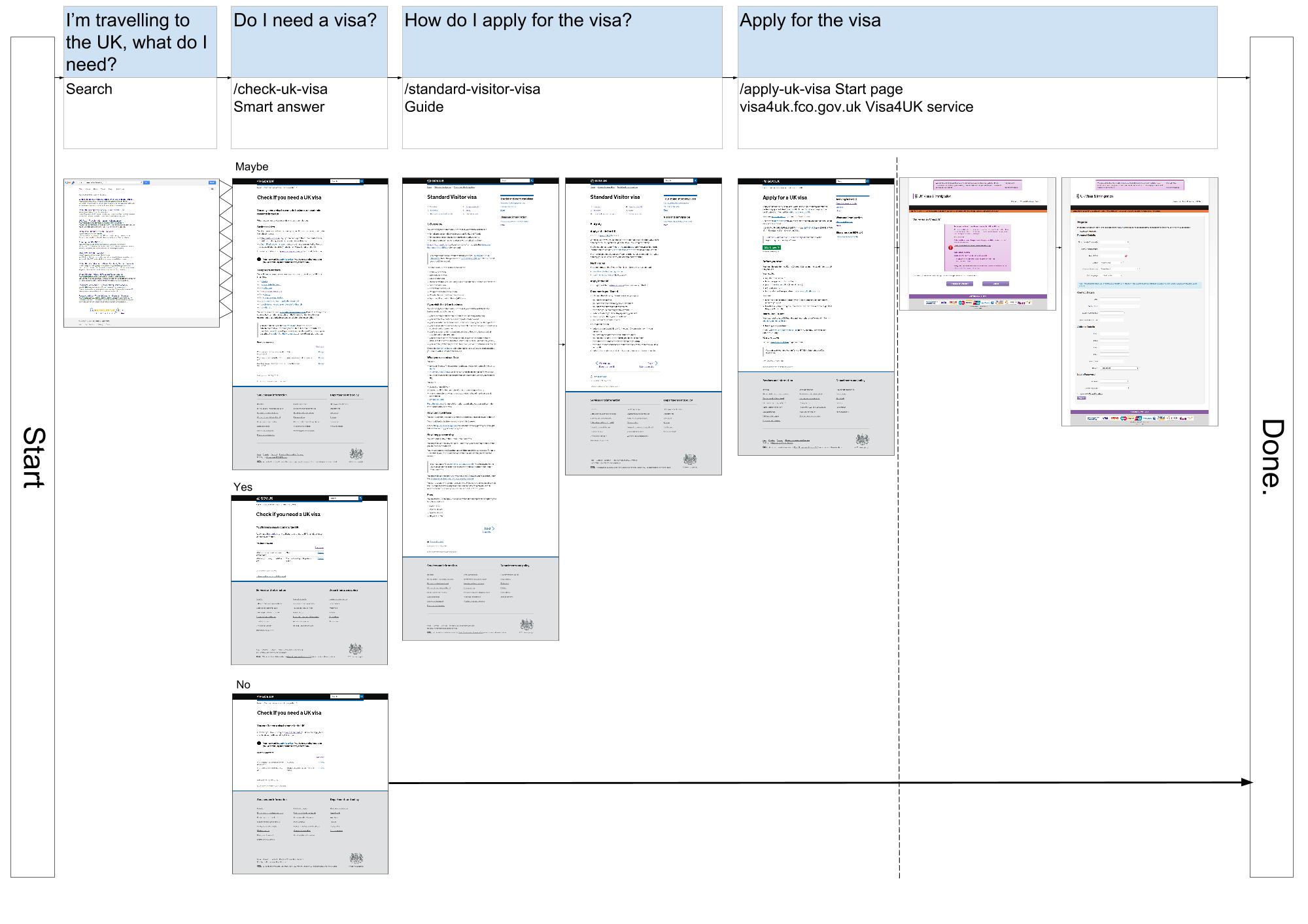
In this example, we deliberately picked a single and successful route through the website, largely for simplicity. There are other ways users might find this content, maybe through different search terms, other pages on GOV.UK or following a link they’ve been given.
I started by putting myself in the shoes of someone planning to come to the UK for the first time, not knowing they'd need a visa to visit.
By googling “I’m travelling to UK, what do I need?”, I find our ‘Check if you need a UK visa’ content. Depending on how I answer the questions about my country of origin and reason for visiting the UK, I'm told one of 3 possible things - I need to apply for a visa, I don’t need to apply for a visa, or I might need to apply for a visa.
I’m then led to read one or more visa guides, before getting to the Apply for a UK visa start page, which whisks the user off to UKVI's ‘Visa4UK’ visa application service.
With this journey mapped, I set up a ‘closed funnel’ in Google Analytics to see how many users are getting through it.
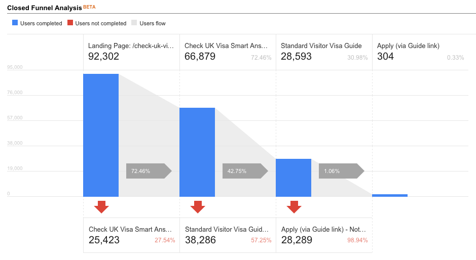
We can only track users up until the start page at the moment, so we can’t see exactly how many then go on to UKVI, but we should be able to track external link clicks soon.
This closed funnel gives us a benchmark figure to measure our work against, and gives us a starting point to compare other user journeys to. Usually, a higher percentage of completions is a good thing, but that isn't always the case. For example, we might find out that 0.33% is exactly the amount of users that should be getting through to the end.
There are 2 things I want to try as a result of this work:
- give users a more definitive yes or no answer in the ‘Check if you need a UK visa’ content, and avoid telling them that they 'might' need a visa (which is not very helpful)
- do some A/B testing where we send 50% of the users directly to the start page once we know they need a visa, and send the other 50% to read the guide first
Taking a step back and looking at content in a specific context is incredibly insightful. The objectivity you gain from this exercise helps test its suitability, and hopefully leads you to come up with some improvements.
Keith Emmerson is a Senior Content Designer on GOV.UK

5 comments
Comment by Fran posted on
What do you have for lunch though?
Comment by Keith Emmerson posted on
Hi Fran,
Thanks for your comment.
I usually make a sandwich for lunch. At the moment I've got turkey, iceberg lettuce, mayo and brie. However, I'm not entirely convinced having the brie in there works.
Keith
Comment by Dominic Hurst posted on
Great article Keith.
Would be good to understand how you created the "closed funnel"? Gather you somehow tweaked ecommerce features?
I'm sure a lot of people would be interested (another blog post perhaps?)
Comment by Keith Emmerson posted on
Hi Dominic,
Thanks very much!
We created a custom report using the beta funnel functionality. There's a short guide to creating custom funnels on the Google Analytics help website.
Keith
Comment by Andy posted on
"do some A/B testing where we send 50% of the users directly to the start page once we know they need a visa, and send the other 50% to read the guide first"
How about redesign the start page / create a page so that it allows you to start the application but also includes (links to) the guidance.
Then LET the user decide!!
Some users will want to know more info, some will want to go straight into filling in the form, but this way at least this gives me as the user (and its all about my needs right!?!) the choice of what I want to do