At the end of April, the Race Disparity Unit deleted one of the most ‘popular’ pages on Ethnicity facts and figures, a website that collects, analyses and publishes government data on ethnicity.
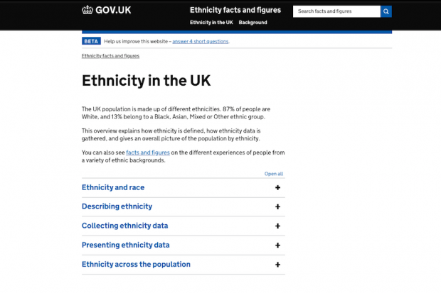
The page, ‘Ethnicity in the UK’, included:
- definitions of race and ethnicity
- links to population data broken down by ethnicity
- guidance on presenting ethnicity data
In this post, I’ll explain why we deleted the page and the evidence we based our decision on. And now that content designers can access GOV.UK data more easily, I’ll also suggest a few things to consider next time you’re using data to make content decisions.
The problem with page views
The ‘Ethnicity in the UK’ page was consistently in our ‘top 5’ (based on page views) since we launched the website in October 2017.
At the start of this year, it was getting around 6,000 unique page views a month, over 5% of our website’s total. The number of page views was also steadily growing.
That’s all good then, right?
It was only after a detailed content review that problems with the page became apparent.
The content designer doing the review noted that:
- the page was trying to meet around half a dozen different user needs
- some content was duplicated on other parts of the website
- some content didn’t meet the criteria for what goes on GOV.UK
Our initial view was that we should delete the page and focus on helping users find the content they really wanted. But we needed more evidence to prove to ourselves (and our colleagues) this was the right thing to do.
Digging deeper into data
We used Google Analytics to see how users were interacting with the ‘Ethnicity in the UK’ page.
We found that:
- of the 5 accordions on the page (which let users open and hide sections of content), the first was opened by 50% of users, and the fourth by 14% – a drop-off rate of 36% seemed high, with many users not reaching content on the page at all
- 4 out of the 5 external links on the page had clickthrough rates of less than 1%
- around half of users who visited the page and stayed on our website went to one of our UK population pages next
This suggested to us that users were brought to the page by search (with Google responsible for 86% of page views), but were confused by the disparate nature of the content on the page, and were ‘dropping off’ the further they went down the page.
We also used the Google Search Console to analyse the search terms people were using to find our website.
We found that around half of all search clicks to the website were from users looking for either:
- information on the ethnic breakdown of the UK
- a list of ethnic groups
We concluded that the ‘Ethnicity in the UK’ page was good at attracting search traffic, but was making users work hard to find the information they wanted.
What we did, and what we learned
Based on the data we’d gathered, we did 3 things:
- deleted the ‘Ethnicity in the UK’ page, and redirected users to our UK population page
- wrote a new title and summary for the UK population page, so we’d continue to attract searches that included common search terms like ‘ethnicity’, ‘population’ and ‘uk’
- rewrote the page about ethnic groups in the UK
This meant users would be able to find the content they were looking for more easily, particularly through search. They wouldn’t have to read content that wasn’t relevant to their needs, and they would be able to work out more quickly if they were in the right place.
Here are a few things we learned along the way.
Make sure you’re looking at the right evidence
Before you start looking at analytics, decide what you’re trying to find out.
If you’re doing a content audit, a simple list of pages and their page views might be enough.
If you want to see if there are potential gaps in your content, you might need to look at on-page searches. Both of these Google Analytics features are available in the Content Data tool, available to anyone with a Signon account.
Start with the problem you’re trying to solve. Then work out what data you need to look at.
Share the evidence
It’s not enough to gather evidence.
Share it in a way that’s understandable for other people.
Find out what people in your team need. What don’t they understand about the problem you’ve identified? What evidence would be most useful to them, and in what format?
We started out by creating spreadsheets of data, but the raw data needed some explanation. So we ended up sharing a 2-page Google Doc which summarised our evidence around 6 key points.
Where relevant, we linked out to GOV.UK guidance and spreadsheets with more data. And we talked through our findings with our senior management team.
Put evidence above opinion
I love the phrase ‘you are not your user’.
I think about it a lot when I hear people saying (with good intentions) ‘I think the website should be like this’, based only on their personal taste.
It’s really common for people to have an opinion about content, and it’s really common that their opinion is based on their own experience.
Evidence like analytics helps to put opinions to one side and demonstrate how real users experience your content.
Realise you won’t get all the answers from analytics
Data and analytics can be really useful in flagging issues with content, but sometimes it might not be clear what to do about a problem.
If you’ve got access to a user researcher, tell them about your problem. Find out if you can test some possible solutions with real users.
Look at what other research is out there. For example, we found research relevant to our problem, that argued ‘spreading content over more, shorter pages will increase the chances of it being read’.
Show us your evidence
If you haven’t already used the Content Data tool, give it a try. Identify something you’d like to find out about your content. Collect the relevant evidence, share it and analyse it with your colleagues. And let us know how it went.
We’re keeping a close eye on our analytics to monitor the effect of deleting one of our most popular pages. We’re hoping evidence will show that, while it seemed like a bold move at the time, it has worked out best for our users.

2 comments
Comment by Anonymous posted on
Hi - this is interesting, thank you.
It would be good to know what user research you did and also what the measurable result was (did it have a positive impact on traffic and outcomes?).
Comment by Spencer Ball posted on
Hi, thanks for your comment.
We didn’t do any user research as we considered that the evidence from Google Analytics was compelling enough to make some changes.
Regarding the impact - I’ve just compared 2 months’ data before and after we made the changes outlined in the blog post (which effectively replaced 3 pages with 2 pages).
Some of the main metrics are unchanged - we’re still getting around the same percentage of our traffic from organic search. And the 2 pages are getting a higher percentage of our overall site traffic than the 3 did previously.
We don’t have the same success measures as a regular transactional service, but we’re happy that we’ve removed an obstacle to some of our most common user journeys (from organic search to our UK population data).