Earlier this year, we began work to make it easier to start a business in the UK. Rather than just looking at individual parts of the process, we are trying to use new data techniques to think about end to end journeys through both content and services. As our understanding of user behaviour becomes more detailed, we can evaluate how effectively GOV.UK is meeting users’ needs and apply this knowledge to our wider work. Our goal is to make it quicker and easier to start a business, supporting new entrepreneurs during a challenging time for the economy.
Using data to visualise and map the journeys
The ‘Start a Business’ team on GOV.UK has been working with data scientists and engineers on the GOV.UK Data Labs team to make better use of end-to-end user journey data, including to see if there are any software or programmes available that can visualise these end-to-end journeys and how we may be able to use them to analyse journeys further to gain a deeper understanding.
The traditional work of a performance analyst in GDS is using the analytical programme Google Analytics (GA). It gives us a lot of functionality in terms of anonymised user data (including the user’s device and their geo-location) and sessions (what pages they visit or elements they click on). However, the interface is limited in being only able to look at a 2 step journey (what page a user is on now and what page a user came from) and therefore is too basic for this work.
We’ve used the underlying data from Google Analytics to be able to see and analyse entire end-to-end user journeys.
Looking at end-to-end journeys, we were interested in all user journeys that went to or through the ‘Set up a [insert business type]’ step by steps. Step by steps on GOV.UK show the logical navigation needed to complete a process on GOV.UK.
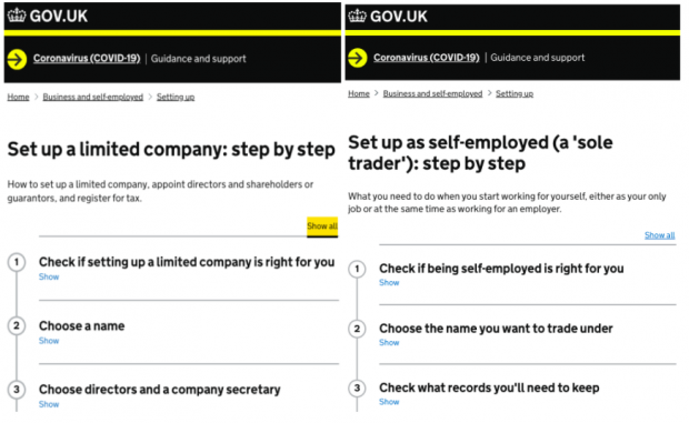
To start, we looked at users’ journeys when going through the ‘Set up a limited company: step by step’ and the ‘Set up as self-employed (a 'sole trader'): step by step’.
Using different tools and approaches to understand journeys
We’ve combined two approaches to using data to better understand user journeys. The first approach is to visualise the most popular journeys. The second is to define a particular journey that we’re interested in, and to see how many users took that journey.
Both approaches examine large datasets to generate new information. We’ve been trialling a tool called Disco for the first approach and a tool called MAQUI for the second approach.
The first approach uses process mining to create an abstract model of the most journeys and interactions then visualises them. It shows clear routes into the step by step, as well as showing which pages users visit, and what they do on those pages - for example, what links they click on or elements (e.g. opening the step by step accordion) they interact with.
This visualisation allows us to begin to identify problem behaviours such as circuitous journeys and bottlenecks.
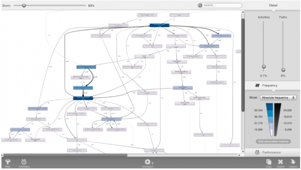
The image above is an example of the visualisation approach using the tool "Disco", showing the most popular user journeys on GOV.UK involving a chosen step-by-step.

The image above is a visualisation of an example of the definition approach, using the tool MAQUI
The second approach involves defining a journey we’re interested in and seeing how many people take that journey via an open-source tool MAQUI. This tool was developed by Terrance Law as part of their PhD ‘Automated yet Transparent Data Insights’, code available via Github.
These tools and software have enabled us to answer much more detailed questions on user behaviours, such as:
- What are the most popular routes into the content?
- What pages do users visit between point A and point B?
- How do journeys vary depending on the device used?
A simple example of leveraging these tools would be ‘how do users get to the step by step?’ and ‘can this journey be improved?’.
Using both tools, we were able to identify that 20% of users travel to the same three pages before getting into the limited company step by step: the Companies House organisation page, the start a company specialist topic page into the limited companies page (the first step of the limited companies step by step) and then finally users using the breadcrumb to navigate to the main step by step homepage for ‘Set up a limited company’.
A simple answer to ‘how can we improve these journeys’ would be to add a direct link to the step by step. This data driven design change could then be assessed using the scientific method with A/B testing.
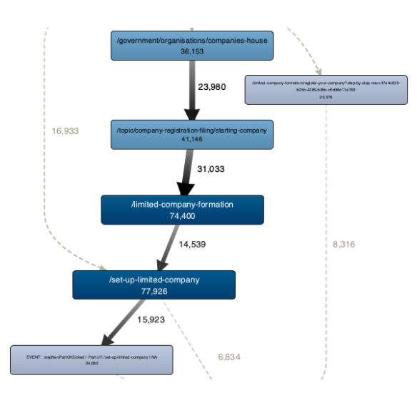
The image above is a visualisation of a common user journey, which starts on the Companies House organisation page, moving first to the Start a company page, then the first step of the limited companies step by step and then the main step by step homepage for setting up a limited company.
Additional insights we have gathered include:
- users re-using the same sidebar navigation for the ‘Register your company’ step, indicating that the start button for the service was not easy to find
- users bouncing back and forth from the limited company content to the sole trader content - indicating confusion over how business naming rules work for different types of businesses
- there are virtually no users (only 3%) using the whole step by step format for the sole trader content, meaning this format is not working effectively. The sole traders step by step has a large number of circular journeys back into multiple competing start pages. The page pointing to self-assessment has about half the click-through rate we’d usually expect from a page of this type.
What we’ve learnt about user journeys
This new way of visualising and conducting performance analysis has proven to be a real game changer for GOV.UK because it has allowed us to make better use of an existing dataset and to be able to analyse a whole problem space like never before. The next step is to see how well this fits with other teams, projects and content in GDS. We want to start applying this type of analysis to other areas, so that we can understand how users are reaching different types of content and evaluate if we are providing them with the best possible service.
Recently we looked at how users were reaching a set of specific content pages. By comparing them to the step by steps used in the first analysis, we have started to see clustering of different user behaviour depending on their routes into GOV.UK. This means that there are users who are using GOV.UK differently depending on the content they are looking for.
As a result, content, tooling and journeys can be better optimised based on the most popular journeys we know users are taking.
The next step for this work is to continue to work with the data scientists and engineers to create reusable code. This will eventually allow the performance analysis community to completely self-serve in being able to access the Big Query data required for their team or project and then to use this new tooling, in combination with the more traditional Google Analytics, to offer a whole new layer of data-driven analysis, insights and recommendations.
By bringing together deep data driven insights with the skills of multi-disciplinary teams, we can really start to apply this knowledge to make high-quality informed changes to user journeys and better meet their needs.
 The GOV.UK app went live in public beta in July 2025. Find out what’s been happening, and what’s coming next,
2 comments
Comment by Andy posted on
Hey, this looks fantastic work. I’m interested to know more about how you took the GA data to get the deeper analysis.
Comment by Daisy Wain posted on
Thanks for your comment Andy. The Google Analytics (GA) data used in our analysis was vital to understand the overall quantity of traffic to different pages in the step by steps (therefore demonstrating the uneven usage of the content). The Google Analytics data also helped us understand how the content fits within wider GOV.UK journeys.