Back in May we wrote about our plan to improve the navigation on GOV.UK and our goal of making government information and services easier to find.
Our team’s work addresses 3 problems we identified in our discovery phase which affect users’ ability to find things on GOV.UK. These are:
- a confusing information architecture
- the usability of site elements on smaller screens
- GOV.UK navigation feels overwhelming for some, and limiting for others
A few months on, we wanted to share what we’ve delivered so far, and what comes next.
What we changed
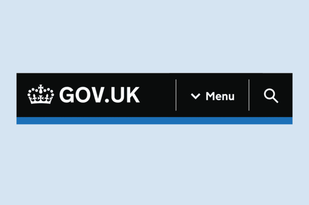
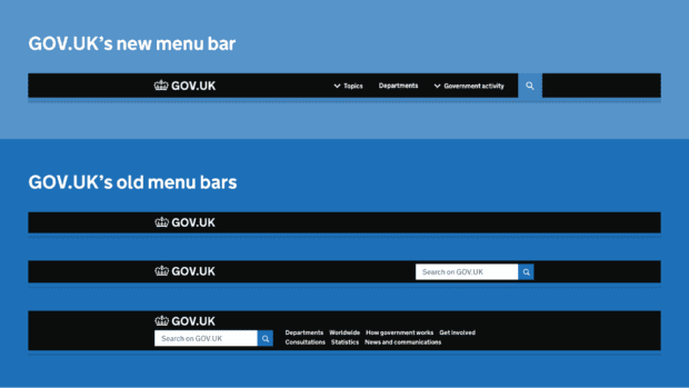
If you’re a frequent user of GOV.UK you may have noticed the first of our changes going live. This is the introduction of a consistent sitewide menu bar, which now appears at the top of more than half a million GOV.UK pages.
This new menu bar replaces the 3 different menu bar styles we previously used, and it allows users to browse the site by:
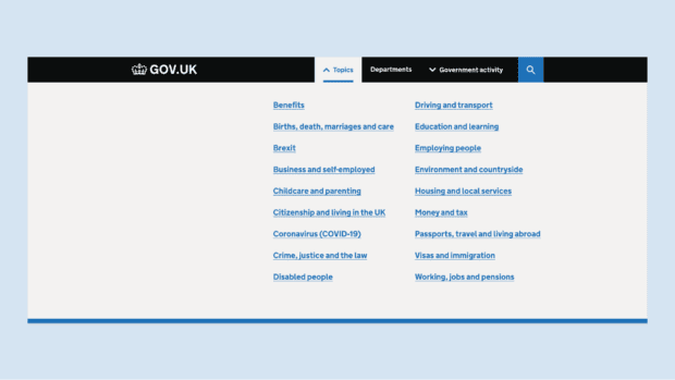
- topic (using the ‘Topics’ link)
- organisation (using the ‘Departments’ link)
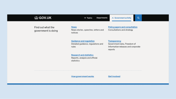
- content type (using the ‘Government activity’ link)
Why we changed it
The core principle of the new menu bar design is that users shouldn’t need to understand the structure of government to find what they need.
This is why we introduced ‘Topics’ as the primary way of browsing from the menu bar. It’s usually much easier for someone to pick a topic like ‘Driving and transport’ than it is to work out whether DVLA, DVSA, Highways England or the Department for Transport publish the information they need.
We know that some users do have a clear departmental model of government, and this is why we decided to carry over the use of a ‘Departments’ link from the older menu bar into these designs.
In user research, we also observed a smaller third group, who are looking for specific kinds of information, often in a research capacity. For example, journalists looking for transparency documents, statistics or press releases. We’ve grouped these formats together under ‘Government activity’. We chose this name to differentiate the long-tail administrative content in this section from the more user-centred information and services presented within ‘Topics’.
Using these 3 elements, our goal was to make it clear how government information and services are organised, and present these as navigation options consistently.
What we learned
Following several rounds of usability testing, we introduced the new menu bar as an A/B test in August. This meant GOV.UK users were randomly assigned into one of 2 groups. One group saw the new menu bar, the other group saw the existing menu bars. This allowed us to directly compare the impact of the 2 approaches.
We found that during the A/B test period:
- the overall share of visits interacting with the new menu bar was 58% higher
- the overall clickthrough rate from the new menu bar was 36% higher
These A/B test metrics, combined with our usability testing, gave us confidence to roll out the new menu bar design sitewide.
A second iteration of the menu bar
Alongside the A/B test measurements, we also reviewed browsing data to map the common paths users took after using the new menu bar. This data comes from our users who opt in to cookies that measure website use.
We found that the journeys for users who selected ‘Topics’ from the menu bar were largely successful, with most users arriving at a content item or service start page.
However, when users selected ‘Departments’ from the menu bar we saw that user journeys were much less successful. Only 19% of users who selected ‘Departments’ went on to reach the organisation page of a specific department or agency. Most users who clicked ‘Departments’ subsequently switched to ‘Topics’, switched to searching, or left the site altogether.
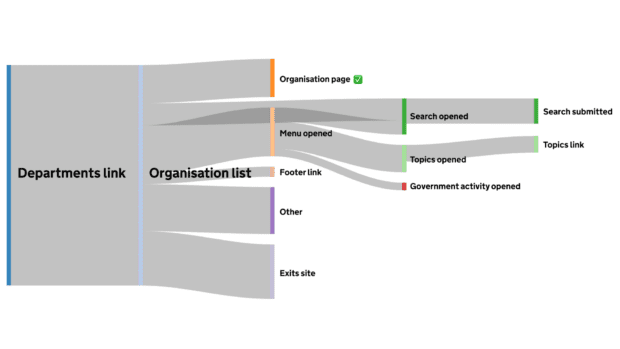
This finding highlights the difficulty of navigating government information by organisation, in part due to the complexity of how the UK government is structured.
Having clicked on ‘Departments’ the user reaches a simple but lengthy organisation list page, this requires them to choose from 23 ministerial departments, 20 non-ministerial departments, plus 416 government agencies and other public bodies. This is the kind of complexity that we don’t want users to have to deal with unless absolutely necessary.
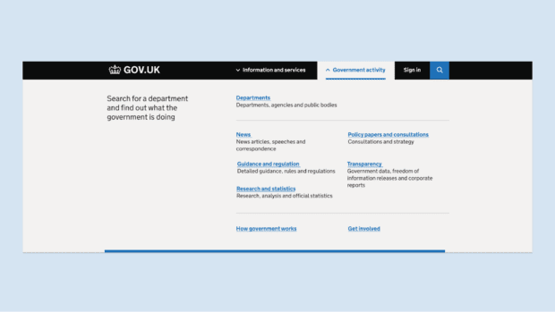
The findings also suggest that the prominence given to ‘Departments’ in the new menu bar design is leading some users unnecessarily into this complexity. In our next iterations we’re going to trial some ways to give greater prominence to ‘Topics’ and test different approaches with the ‘Departments’ link. Our first step will be to move the ‘Departments’ under ‘Government activity’ (shown below). We also plan to test alternative naming options for ‘Topics’ to make the proposition clearer, for example, ‘Information and services’. We’ve also added a ‘Sign in’ link’ to our designs, this won’t go live immediately, but is part of our planning for the rollout of the GOV.UK Account as part of the one login for government strategy.
As before, we’ll be monitoring the user journeys closely to understand the impact of these changes, and sharing what we learn.
What comes next
The menu bar is one of 5 elements we’ve identified as critical to browsing the site. These are the:
- menu bar
- homepage
- topic pages
- page-level navigation (breadcrumbs and related content links)
- footer
We’ve been prototyping and testing updates to all these elements so that they function together as a consistent system. Following the menu bar iterations, the next element to be updated within this system will be the GOV.UK homepage, and we will be blogging about this soon.
Subscribe to Inside GOV.UK to keep up to date with our work
GDS is hiring - come join us!

10 comments
Comment by Andy Porter posted on
Can you tell us about the change to Search - replacing the box with just an icon.
Comment by Sam Dub posted on
Thanks for the question Andy.
We did have an initial concern that this design change might reduce the rate of users searching. Sitewide, the change hasn’t reduced the rate of users searching, but does free up space for new browse options without us needing to increase the menu bar height.
It’s something we’ll be keeping an eye on, and may revisit in future iterations.
Thanks, Sam
Comment by Steve Malone posted on
A related question. How does the the new system score on accessibility? I always try and avoid conditional reveals like drop down menus as much as possible
Comment by Owen Jones posted on
Hi Steve
We've made a conscious effort to build the menu bar with as many different user needs as possible in mind, testing against a number of different assistive tech and scenarios including screen readers, magnification, high contrast and no-js/no-css. On conditional reveals specifically, we've used aria roles such as aria-label and aria-expanded to expose the user interface to screen reader users. This allows both sighted and non-sighted screen reader users to navigate the header smoothly without causing confusion or withholding information.
Some other things we've done to consider accessibility:
- Use a content shift approach to opening the menu over a "modal" approach to avoid keyboard navigation users getting lost trying to navigate out of an open menu
- Use visually distinct hover and open states for our navigation buttons so that colourblind users are able to distinguish our different button states
- Construct our links within open menu sections in such a way that they're easily scannable for keyboard navigation and screen reader users
- Leverage the HTML "hidden" feature to ensure that the no-js and no-css views of the navigation are still usable and digestible
Thanks, Owen
Comment by Thomas Thornley posted on
Will this be added to the design system? Can it be used inside a service?
Comment by Sam Dub posted on
Hi Thomas,
That’s a good question. We think there are two different sets of needs here. The design system header component (https://design-system.service.gov.uk/components/header/) is for navigation within a service, and should continue to be the only one used by service teams.
This one is for the rest of GOV.UK, it’s designed to help users find the right service or content item for their needs. We’re working closely alongside the GOV.UK Design System team to share learnings and ensure the experience is consistent between the two.
Thanks, Sam
Comment by David Johanson posted on
This assumes that users prefer to use the navigation, and almost hides the search, so to speak. I guess you are doing this to move away from the bad search experience? In the end, no one delivers a better search than Google, so that's understandable.
Comment by Sam Dub posted on
Hi David,
Our user research showed different preferences for different user groups, some preferring to browse, others preferring to search. Our data showed 3 times as many users browsing as using site search, and that was a big part of the reasoning behind making browse the priority. Site search hasn’t been forgotten about though, and is on our radar for improvement.
Sam
Comment by Kristian posted on
Are there any reasons why search hasn't been prioritized in this big redesign?
Comment by Sam Dub posted on
Hi Kristian,
As mentioned in the response to David’s question above, the initial prioritisation came down to the number of users using search vs. using browse. Ultimately, we want the experience of both to be great, and site search also merits a significant update.
Sam