Updating the GOV.UK homepage
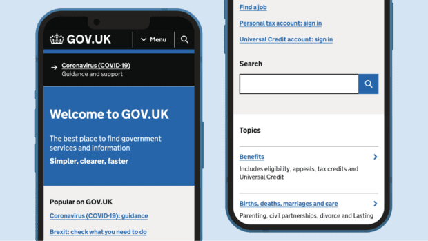
We’ve made design changes to the GOV.UK homepage to improve its accessibility and make it a better user experience for the millions of people that visit it every week.

We’ve made design changes to the GOV.UK homepage to improve its accessibility and make it a better user experience for the millions of people that visit it every week.

Learn why and how we updated the GOV.UK sitewide menu bar.
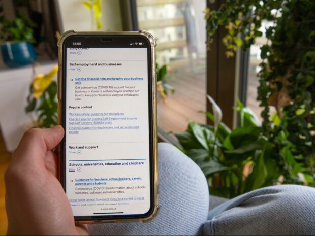
We updated an accordion component to be more accessible and here’s how we did it.
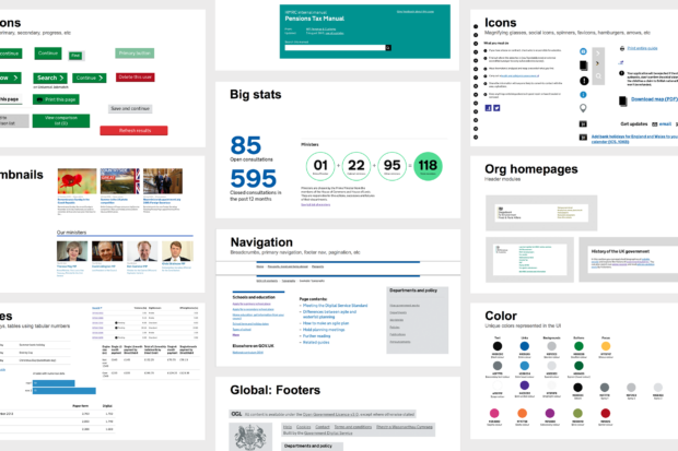
GOV.UK is a large and complex website that uses a range of different layouts and design elements. We've been improving the site's user experience by tackling design debt and building a universal navigation system.
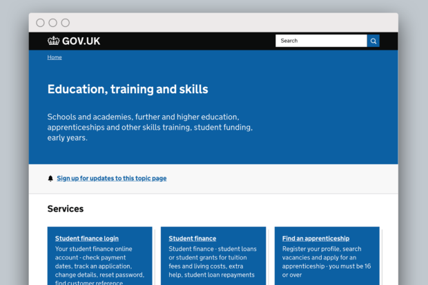
Users can struggle to find what they need when they navigate through GOV.UK. Topic pages will help them find what they're looking for more easily.
A blog about running and improving GOV.UK, for anyone who is working on GOV.UK or interested in how the digital home of the UK government works. Written by the Government Digital Service team.
Subscribe to Inside GOV.UK to keep up to date with our work.
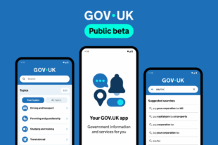 The GOV.UK app went live in public beta in July 2025. Find out what’s been happening, and what’s coming next, on the GDS blog.